Clinic colours: one palette, different functions
White walls are not the only option. Colour can distinguish rooms, guide visitors and maintain a coherent interior.
 Luxury Uzbekistan editorial team
Architecture and interiors
What we consider
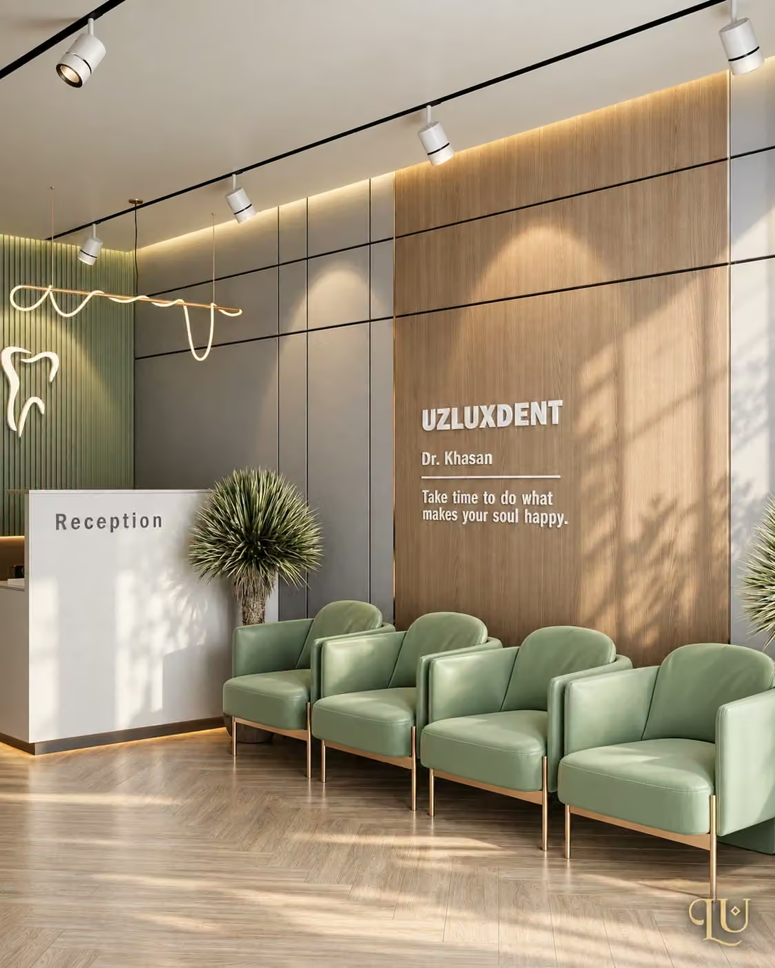
Build the palette in three layers: a calm base, a wayfinding accent and a brand colour. Do not automatically repeat a strong reception colour in every treatment room. Compare samples in morning, evening and artificial light. A render cannot guarantee the actual paint colour. Reviewing floors, doors and furniture together reduces random purchases later.
Neighbouring surfaces affect colour
A white paint sample can look different beside wood, stone or green fabric. A phone photograph is insufficient approval. View samples in their intended room and different lighting conditions. Reception and treatment rooms need not have the same amount of accent colour.
Record the decision
The palette should show each colour's code, location and neighbouring materials.
A practical next step
Record a primary, secondary and accent colour for each room. Keep one approved sample set on site.
- Record colour codes
- Check under lighting
- Review materials together